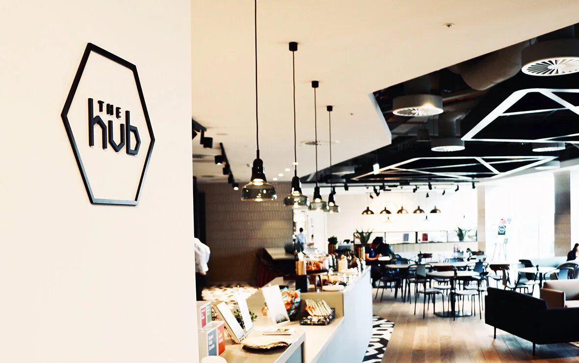
A new cafe brand for a city client. Inspiration for the logo was taken from the architectural design of the environment with the strong geometric shapes on the tiles and ceiling.
The Hub being a place where people meet, socialise and work. The natural honeycomb shape fits the whole concept.
The contemporary colour palette matches with the environment.
Logo was applied to:
Signage
Promotional material
Large screens
Menus
Loyalty cards
Shelf strips


